Tuesday 28 February 2012

Mood Board

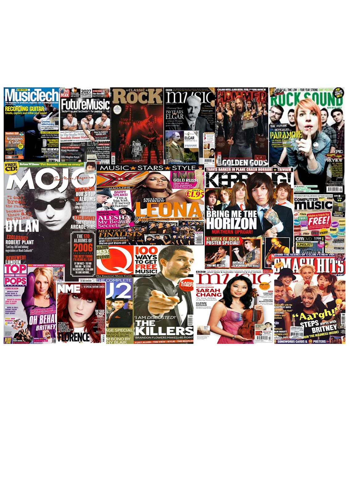
Being at the start of the main task, I wanted to research existing magazines and identify want genre I was going to create in my own magazine. I tried to get a varied amount of rock, pop etc. From this task I have seen how the colour schemes work and how important it is to choose the use of colour to complement the genre. I will now research a specific gender that I wish to create, this mood board has given me a base to work with and inspiration and ideas.

Maslow's Hierarchy of Needs

MASLOW’S HIERARCHY OF NEEDS

Abraham Maslow proposed this theory in 1943. Maslow subsequently extended the idea to include his observations of humans' innate curiosity. His theories parallel many other theories of human development psychology, all of which focus on describing the stages of growth in humans.

Audience Theory

School Contents Page


To follow my title page, this is the contents page in the similar layout and style for the School Magazine. I have used my own photo (mid shot of a student) and I have edited it, for example I changed the opacity. This would give it a better effect. The colour scheme I thought I would keep the same throughout the magazine, otherwise too many colours can over crowd the pages. The list of pages gives a short detailed sentence of what is included, I may need to shorten the amount I write and add something in the left hand column.   
Things to improve on / or that I could change...

The colour scheme, I could use less colours this would make it look less busy and would create a better design.

The title, the colour stands out against the background, however the style of the typography itself is plain.

School Front Cover


This is my design for the front page and I think that this worked very well.  The reason why this design works better is because the colours used. I have used a small number of colours and keeping it simple and effective with colours that appeal to both genders. The main image used (mid shot of a student), I edited to suit the design style more. There are a few story lines, which would draw attention to the students.
Things that I could change / or improve...
I could experiment with different colours, either the background colours or the font colours.
I could change the layout of the boxes, this is where the text goes and the text does look fairly small, I should try to avoid small text, it would need to be bold and readable. 

Title & Contents Page - Possible Layouts


Top Left - This layout doesn’t make the cover seem overcrowding but filled with enough information to keep readers happy. The colour scheme I would keep simple, I would do this by using no more than three colours. I would also need them to be suitable for the target audience and appealing to both audiences.  The images would be my own photography of students at work.  Bottom Left - This is my first design for a contents page for a school magazine. This would link to the above title page as it follows the same layout. The colour scheme would most likely be the same throughout the magazine. The contents list would include a brief sentence about what is on each page. The main image would be my own photography of a student during the school day. Top Right - This layout doesn’t make the cover seem overcrowding but filled with enough information to keep readers happy. The colour scheme I would keep simple, I would do this by using no more than three colours. I would also need them to be suitable for the target audience and appealing to both audiences.  The images would be my own photography of students. Bottom Right - For my second design I used a previous magazine as my influence. Camera film is scrolling across the top of the page; this would contain images of the school. In the middle of the page will be the contents list, towards the bottom will be possibly a mid shot of a student at work, again I will take the image myself and then edit it. In the other side of the corner, there will be contact information.


Name Ideas

The school magazine that I am creating as a practise before the final piece needs to have the most obvious features, so for example an image and text. One of the features that I think is very important is the title, it needs to be eye catching, easy to remember and suited for that type of magazine.
So here are a few ideas as to what I may call my school magazine.
  1. Schools Out - I though of Schools Out because it would fit in with the content of the magazine it was going to be an end of term issue, supplying the students with any information related.
  2. GHS - I simply shortened Greenshaw High School, having a short title oftens helps it to be more memorable, and will not take up the whole of the page, leaving plenty of room for design.
  3. Greenshaw Weekly  - I thought the school could do a weekly issue (maybe not with the same contents as idea 1), but if it informed them on events taking place etc.
After considering each idea, I have decided to go with idea number 1, it is a catchy title that I think will appeal to students, there is certainly more information that I can put in this relating to the title.

Research into existing school magazines


After researching current school magazines I selected three. Each magazine has something different which makes the design unique. My favourite out of these three is Phoenix 2011, it suggests that it is a leavers book (possibly), however I like how involved each student was by signing the front page. The contents page is full of information, with a paragraph of an introduction. If there was more colours or a different selection, it could be that the contents page wouldn't work as well. The top design FFH looks like an end of year magazine, looking back on the achievements throughout the terms. They have taken a photo of their students, and they look like they have used colours related to their school.

Second Skins Magazine


This is my second design for the Skins Magazine. Being the second design it was easier and quicker to create. Throughout creating the design, I used as many of the tools as suggested and I now know what each tool is made to do and what the outcome would look like. Like before the colours are bright and bold. The images are clear and eye catching, all of these help make a magazine a success. I tried to include all the typical
features of a magazine: a title, sub heading, issue number and price, a possible slogan or a phrase.

Skins Magazine


Our task was to create a magazine cover for Skins by following instructions to guide us through Photoshop.We were not meant to spend too long on this task, I was able to complete it within half an hour.  I changed some aspects, like the colour blue, and the shapes that the text are in. Each of the images I opened into photoshop and edited them, for example I cropped most of them, I changed the opacity and I edited the colouring. The blur tool was something we had to practice using, and I tried using it, however I don't think I used it correctly. If there is any time I will be sure to practice with this tool. As a whole, the layout and images are bright and eye catching for the younger audience.