Looking back at your preliminary, what do you feel you have learnt in the progression from it to the full product?
The preliminary task was set for two reasons, reason one was to allow students who were not confident in using Photoshop the time to get to know their way around the soft ware in order to have a better understanding when creating their final piece. Reason two was to get us thinking of all the elements and components a professional magazine consists of for our final piece to look as professional as existing products.
As the preliminary task was almost like a 'starter activity' I didn't want to spend a long time on it when I could be thinking of ideas towards my final piece. The preliminary magazine we designed was to be a school magazine, either something for the students or something for the parents, containing news, gossip or listed achievements.
The creation of this front cover is mainly shapes and I have just put text into them, which is not very professional, I think for it in order to attract the students the cover should have been more appealing, with vibrant colours, or more pictures and catchy titles. This is a main contrast to my final piece front cover, I made sure I used vibrant colours, more than one picture, interesting fonts; these elements I believe help towards making my final cover look much better than the preliminary task.
For the preliminary task we also had to create a contents page, mine followed on from the front cover, keeping the same layout and colour scheme. My contents page lacks images, bright colours all which make it dull and unappealing. Again my final piece contents page is a huge contrast to this and it looks a lot more appealing. For the final piece contents I kept to the same colour scheme, however I added images and a print screened front page. Unlike the preliminary, the layout of the text I put into columns and kept them short so not to lose the public interest thinking there is too much to read.
The preliminary task certainly helped me towards the design of my final piece, as I knew what I would change, what I could add in order to make the final piece looking professional.
We didn't have to create a double page spread in the preliminary so when it came to the final piece, it was a bit of an experiment. I had looked at existing magazines for inspiration and from that I hand drew a plan, as to what my double page spread would consist of. For the body of the text, I kept to 10pt in font size, I didn't want to go above this as I would run out of room, however it may be a bit small and I would need to consider that when designing a magazine it needs to be a reasonable size. It was very useful having been to a concert recently and having taken a variety of photos. I feel that I used the right amount of photos and text throughout my final magazine to satisfy the target audience.
Throughout the course I feel I have progressed with the design style and creations I made. I feel I have learnt from the preliminary task as to what I could or should have done in order to make the product better, and from this I was able to use it towards my final design. I have also learnt how important it is to manage my time, and spend time planning; for example on an A3 piece of paper and have three different designs with different elements, then I could of used some from each design. I have learnt the amount of research is just as important as the designing progress, Without the research I wouldn't know what my target audience would like (the questionnaire helped me) I would know what magazines are already on the market and what they include that I possibly should (the radial analysis).
Saturday, 14 April 2012
Friday, 13 April 2012
Evaluation: Question 6
What have you learnt about technologies from the process of constructing this product?
Throughout this project I used a variety of software's and programmes in order to complete my practical. Before this work was set I was unaware of Blogger (as a website) and I have never had a 'blog' account, therefore it was a new process I needed to get used to in order to publish all of my work. As I familiarised myself with the website, I was able to publish posts which had embedded images, or documents uploaded from Youtube and Scribd; furthermore I was able to publish a poll I had created and I received answers which helped me when creating my final piece.
Any of my designs, for instance the preliminary task and the final piece were created using Adobe Photoshop CS5.1 (64bit). Unlike Blogger, I was very familiar with this software as I have used it in other subjects. This gave me an advantage point as I would not need to spend time getting to know my way around the programme.
A new website I was introduced to was Prezi, this is basically a different version to Microsoft Powerpoint. It allows you to add your information and images to and lay them out in whatever way you want. It is the type of website that is perfect for a presentation. If I had more time, I would have spent it looking around the website and trying see how could I improve the design and the creation, to make my Prezi that bit more interesting. As I have mentioned I have used Microsoft Powerpoint for a fair bit of my work, I laid all my information onto the slides, trying to make the layout as interesting as possible. Then I had to use Scribd to upload this in order to present it within my blog.
For my preliminary task and the final piece I had to take my own photos and use this within the pieces as anything we created had to be original. I used my own Digital Camera in order to take the photos, and whilst undergoing this task I was considering the different shots and focuses I could use to enhance my product. Once I had uploaded the photos to the computer I edited some, by cropping, or auto correcting the lighting.
Tuesday, 10 April 2012
Saturday, 31 March 2012
Friday, 30 March 2012


Sunday, 25 March 2012
Friday, 23 March 2012
Name Ideas for my Music Magazine
1). Pop Chart UK - My first thought was to create a radio station magazine, I think it would appeal to a larger audience (ranging from anyone who listens to the station and anyone who is a fan of Pop music). The name 'Pop Chart UK, relates to my genre, it is the type of name a radio station could be called and it is a easy, simple name to remember.
2). London's Music - This was a phrase from Capital's (existing radio station) T.V. advert. This name has pros and cons to using it as the title for my magazine. The pros are it is again a simple and easy title to remember, it would appeal to those living within the city. However some of the negatives is that I don't want to narrow down my target audience to a specific place like London. I do have a target as in teenagers to young adults, but other than that, I want to stay as open as possible.
3). LTH (London's Top Hits) - My last choice is similar to the last, it specifies London. However whether I manage to change it or not, I really like this idea. It works well for a radio station and with the shortened title it will be recognisable and memorable. Having the short title would also allow more components on the page, which could create a better layout.
Various Font Styles

This task was to help me choose a font suitable for my theme. Whilst designing I need to remember that the style of font, the colour schemes all have to reflect Pop music. These fonts I found on dafont, a font website, I tried to pick 7 fonts that I thought reflected Pop music. Out of my choices I think the most suitable is the 3rd down. It is bold, and with colour it would stand out which is what I would want the title to do. Although that is the most suitable I prefer the 2nd and 4th styles. I think they would appeal more to the target audience of females and it also looks handwritten which gives it that informal approach and I think the target audience would feel more comfortable with this style.
Sunday, 18 March 2012
Friday, 16 March 2012

Tuesday, 13 March 2012
The Objective of my Questionnaire
The purpose of this questionnaire is to establish the main needs of my target audience. This will be done by using secondary information such as the gratifications. This primary research will help me learn the qualitative and quantitative data of the sample I choose. The majority of my sampling group will be my target audience; this will be teenagers and adults in the early twenties. My sample will be kept small in order to collect the data in time. I plan to ask ten people, various ages and hopefully from that I will get a range of data which will help me to produce my magazine. I want to have a range of qualitative and quantitative data, each have their own pros and cons; which is why I think an equal amount will get me good enough information to use. I need to keep in mind that this questionnaire needs to logically flow and the questions must be unbiased.
Type of questions I plan to include would be:
Quantitative Data: Personal Details, Hobbies and Technology Usage
Qualitative Data: Colour Schemes, Imagery, Layout, Price (Preferences and Opinions).
Type of questions I plan to include would be:
Quantitative Data: Personal Details, Hobbies and Technology Usage
Qualitative Data: Colour Schemes, Imagery, Layout, Price (Preferences and Opinions).
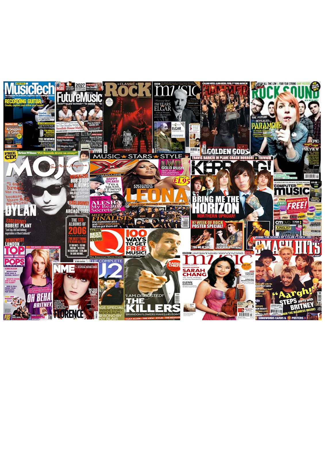
Generic Conventions of a Pop Magazine
· Vibrant and bright colours are used for the front page
· Imagery has been laid out in a collage form which is informal but appealing
· Titles are bold and match the colour schemes on the page
· Text can have a drop capital at the start to indicate where to start reading
· The contents list is laid out into separate columns
· The main image either sits in front or behind the heading
· Each page is busy, there are no blank spaces
· Font size is around 11pt
· Top of the front cover generally advertisement – a feature in magazine or a sales item
· All headings are in colour, but the body of the text is in black and simple font.
· The main story often has a related image on the front page which is larger than the rest
· Headlines are quite short and simple
· Quotes are often used from an artist (a story featured in the magazine) on the front cover
· The colour scheme usually stays the same throughout the magazine
· The contents list is short sentenced and doesn’t give the stories away
· The way text has been written is informal and this would appeal to the Pop target audience
Sunday, 11 March 2012
Tuesday, 6 March 2012
Ideas for my Music Magazine
What genre will I be using throughout my magazine?
I will be focusing on Pop Music, this is mainly because it is an area in music I like; which I think will help me when designing if I like the area I am trying to create. Another reason I chose Pop Music is because it is a wide area, and a range would easily fit under the title Pop.
What will be my chosen target audience?
My target audience will be the younger generation, teenagers and adults in their early twenties would fall into this category. This age range would be suitable as I would find it easier designing something that should appeal to my age group. It would also be easier to get opinions whilst creating and the opinions from the questionnaires.
What key features will need to be included in my magazine?
Main images - this will be my own photography, featured articles, credits, typography style, colour schemes and layout, a note from the editor and an introduction. Each of these features will have to be original, and therefore I need to think carefully in order for it to look professional.
Tuesday, 28 February 2012
Mood Board
Being at the start of the main task, I wanted to research existing magazines and identify want genre I was going to create in my own magazine. I tried to get a varied amount of rock, pop etc. From this task I have seen how the colour schemes work and how important it is to choose the use of colour to complement the genre. I will now research a specific gender that I wish to create, this mood board has given me a base to work with and inspiration and ideas.
Maslow's Hierarchy of Needs

MASLOW’S HIERARCHY OF NEEDS
Abraham Maslow proposed this theory in 1943. Maslow subsequently extended the idea to include his observations of humans' innate curiosity. His theories parallel many other theories of human development psychology, all of which focus on describing the stages of growth in humans.
School Contents Page

To follow my title page, this is the contents page in the similar layout and style for the School Magazine. I have used my own photo (mid shot of a student) and I have edited it, for example I changed the opacity. This would give it a better effect. The colour scheme I thought I would keep the same throughout the magazine, otherwise too many colours can over crowd the pages. The list of pages gives a short detailed sentence of what is included, I may need to shorten the amount I write and add something in the left hand column.
Things to improve on / or that I could change...
•The colour scheme, I could use less colours this would make it look less busy and would create a better design.
•The title, the colour stands out against the background, however the style of the typography itself is plain.
School Front Cover

This is my design for the front page and I think that this worked very well. The reason why this design works better is because the colours used. I have used a small number of colours and keeping it simple and effective with colours that appeal to both genders. The main image used (mid shot of a student), I edited to suit the design style more. There are a few story lines, which would draw attention to the students.
Things that I could change / or improve...
•I could experiment with different colours, either the background colours or the font colours.
•I could change the layout of the boxes, this is where the text goes and the text does look fairly small, I should try to avoid small text, it would need to be bold and readable.
Title & Contents Page - Possible Layouts

Top Left - This layout doesn’t make the cover seem overcrowding but filled with enough information to keep readers happy. The colour scheme I would keep simple, I would do this by using no more than three colours. I would also need them to be suitable for the target audience and appealing to both audiences. The images would be my own photography of students at work. Bottom Left - This is my first design for a contents page for a school magazine. This would link to the above title page as it follows the same layout. The colour scheme would most likely be the same throughout the magazine. The contents list would include a brief sentence about what is on each page. The main image would be my own photography of a student during the school day. Top Right - This layout doesn’t make the cover seem overcrowding but filled with enough information to keep readers happy. The colour scheme I would keep simple, I would do this by using no more than three colours. I would also need them to be suitable for the target audience and appealing to both audiences. The images would be my own photography of students. Bottom Right - For my second design I used a previous magazine as my influence. Camera film is scrolling across the top of the page; this would contain images of the school. In the middle of the page will be the contents list, towards the bottom will be possibly a mid shot of a student at work, again I will take the image myself and then edit it. In the other side of the corner, there will be contact information.
Name Ideas
The school magazine that I am creating as a practise before the final piece needs to have the most obvious features, so for example an image and text. One of the features that I think is very important is the title, it needs to be eye catching, easy to remember and suited for that type of magazine.
So here are a few ideas as to what I may call my school magazine.
So here are a few ideas as to what I may call my school magazine.
- Schools Out - I though of Schools Out because it would fit in with the content of the magazine it was going to be an end of term issue, supplying the students with any information related.
- GHS - I simply shortened Greenshaw High School, having a short title oftens helps it to be more memorable, and will not take up the whole of the page, leaving plenty of room for design.
- Greenshaw Weekly - I thought the school could do a weekly issue (maybe not with the same contents as idea 1), but if it informed them on events taking place etc.
Research into existing school magazines

After researching current school magazines I selected three. Each magazine has something different which makes the design unique. My favourite out of these three is Phoenix 2011, it suggests that it is a leavers book (possibly), however I like how involved each student was by signing the front page. The contents page is full of information, with a paragraph of an introduction. If there was more colours or a different selection, it could be that the contents page wouldn't work as well. The top design FFH looks like an end of year magazine, looking back on the achievements throughout the terms. They have taken a photo of their students, and they look like they have used colours related to their school.
Second Skins Magazine

This is my second design for the Skins Magazine. Being the second design it was easier and quicker to create. Throughout creating the design, I used as many of the tools as suggested and I now know what each tool is made to do and what the outcome would look like. Like before the colours are bright and bold. The images are clear and eye catching, all of these help make a magazine a success. I tried to include all the typical
features of a magazine: a title, sub heading, issue number and price, a possible slogan or a phrase.
features of a magazine: a title, sub heading, issue number and price, a possible slogan or a phrase.
Skins Magazine

Our task was to create a magazine cover for Skins by following instructions to guide us through Photoshop.We were not meant to spend too long on this task, I was able to complete it within half an hour. I changed some aspects, like the colour blue, and the shapes that the text are in. Each of the images I opened into photoshop and edited them, for example I cropped most of them, I changed the opacity and I edited the colouring. The blur tool was something we had to practice using, and I tried using it, however I don't think I used it correctly. If there is any time I will be sure to practice with this tool. As a whole, the layout and images are bright and eye catching for the younger audience.
Subscribe to:
Posts (Atom)